Wednesday, October 29, 2014

Hawaiian Hallway - Interior Space - Project 3

For this project we had to pick an interior we wanted to create and the first thing my mind went to was a picture I took when I went on a trip with my best friend over the summer of an abandoned building.  The original picture I took looked like it was basically all black and white in the first place except it had a few brown tones in it, but I wanted to stick with blacks and whites for this piece because it seemed like a fun challenge.  I've always loved using charcoals, so I chose that as my medium, but drew on a black piece of paper rather than plain old white paper. 
This is an in progress picture of the piece when I was still figuring out what parts of the original photo I wanted to include since the paper was shaped differently.  I had a lot of fun creating this piece and got a lot of good feedback from others during class that watched me create this.  I got good tips on blending from my classmates and figured out a few good techniques to get the shading right.  

This picture is the final product.  I ended up adding the ceiling in the picture which I was hesitant to do because I didn't want it to take away from the focus on the door and the flooring, but I loved how it turned out.  While making this I learned how to blend the white and black charcoal to make different variations of grey's for the board that were leaning against the wall and for smaller details. I always ridicule the little details in my pieces so I tried my best at adding all the knots and spots where the paint was chipped in the door and I am very pleased with how it turned out.  The texture in the wood looks fantastic and I can't help but daydream about going back to this exact place. 

Practice With Oil Paints

In class this year one of our goals is to challenge ourselves and try out mediums we have never used to make a piece.  We never did much when it came to oil paints and I was ready to be adventurous, so our class decided to experiment and test out the paints before we started our new projects.  We painted pictures of fruits using both pallet knives and regular brushes and this is how mine came out.
The first picture I have here was made with regular brushes and I was extremely pleased with how it turned out.  I learned that you had to be careful and patient with the oil paints because they are thicker and don't dry quickly, but I eventually caught on and learned new techniques for blending and adding highlights. I wanted to keep the whole picture bright so I chose bright colors for the background as well to keep it light and happy.  I was afraid the bright green would mess up the leaves that are on top of the orange but I was able to make a lighter green for the back and loved how the leaves didn't get lost in the picture. 


I have come to love using oil paints with brushes but I had a lot of trouble using the pallet knives.  I didn't get a chance to finish the practice piece with a pallet knife so I can't say I learned a lot from the experience but hopefully I can try this again soon and maybe learn some new techniques.  All I know so far is that it was very hard to try to do highlights and shadows because I couldn't thin the paint out much and it became sort of messy looking.  I prefer using brushes at this point but pallet knives seem like they would be a lot more fun to use on a painting that's not this small.  

Friday, October 17, 2014

Gaston Vibes - Reflection - Project 2


I have struggled in the past with colored pencils because I am usually never satisfied with the blending and it's not always easy to get the right coloring. I had to learn how to blend more and layer the colors, and I'm pretty happy with how the final product turned out.  I had trouble blending the clouds but compared to the original picture I based this off of the highlights and colors are very similar.  I definitely gained a lot of skill using prisma colored pencils and I've definitely come a long way compared to old projects I tried doing using this medium.  When adding details and shadows became challenging I had to just take a step back and decide what I had to add or fix that was necessary, and what wasn't worth obsessing over.  I'm glad I used that strategy or I would have spent a lot more time than I did drawing and redrawing bits and pieces that were already good.  It was a bit of a stressful process but the textures in the water and the trees in the back look great and I love how the "reflections" and the shadow of me in the kayak turned turned out in the water.


Thursday, October 16, 2014

Chaco Livin - Object - Project 1


I have never used oil paints before this project except for a small practice painting of an orange.  I originally planned to use pastels to create this project but I decided to step out of my comfort zone and it took awhile but I finally figured out how to handle the paint since it takes a lot longer to dry than acrylics. I started to have second thoughts about working on this because it took forever to get the right textures and adjust the lighting but I kept at it and I'm happy with how the shoes came out and how the light reflecting off the background looks.  This picture was a lot more intricate and required a lot more attention when it came to adding value but I still enjoyed the learning process that came with the project.  I struggle with obsessing over little details sometimes so I had to take a step back and decide if certain parts were really worth stressing over.  I asked a few people for their opinions and they all said it looked great but if I get the chance I'd like to possibly edit part of the molding but other than that minor bit, I wouldn't change a thing about this piece.  I was asked a lot in class why I decided to paint Chacos and the best answer I could give people was that my sister and I live in them 24/7 and she gave me a pair for my birthday one year and it was probably one of the best presents I've ever gotten. Chacos describe my sister and I's personalities perfectly so I wanted to depict that in this by using the bright colors and making it an overall happy painting.

Monday, June 9, 2014

Missing Piece - Parallel Project Reflection

   For this project I had to work through some of the challenges that were thrown at me along the way and be careful not to add too much or too little detail to certain spots to make it look better. I was thinking at one point I could just use stencils to make the rhino but I was told I needed to challenge my artistic abilities and try to just paint it by hand. Considering how it worked out I'm pleased with the piece and even though it's not fully finished yet, I'm still excited to see the final product.
   I had to practice a bit with stippling and getting the right shades of paint for different shadows, but they turned out pretty well. I wasn't sure if I'd get the paint in the right spots but the stippling really added to the texture and made the rhino so much better than before. Instead of choosing regular painting to create the texture of the skin, the stippling did that for me and made the skin look a lot more realistic and almost rough looking.

Parallel Project Preview

I used many of my own unique ideas in this piece, and found it to be one of my most successful pieces this year. Our teacher told us to create a piece based on a current event we found, and I found on poachers who hunt down rhinos and cut off their horns so they can be used for many reasons like for medicines or just to make large sums of money. I decided to base my piece off of some of the pictures I found of the injured rhinos to make my piece, and when I thought about what mediums to use, I had the idea of using a puzzle with missing pieces to better represent the message I was trying to give off. 
I don't know of any pieces in particular that are like this one but I got the idea from a puzzle I once had of some wild animals in africa, and if you took out certain pieces of the puzzle, parts of the animal's faces or bodies would be missing. I took the idea and ran with it and luckily found the perfect picture to help me create my piece. 
My artwork is intended to show that if we take advantage of beautiful creatures like rhinos, we are taking a part of their identities away for our own selfish purposes. The issue I primarily examined was the problem our world has with poachers, and how we need to do a better job of giving these animals the proper treatment they deserve and protecting them from any danger that does not normally occur in their natural habitats. This artwork shows a bit of what I am like because I am very aware of problems such as these and I care a lot about what we do with our wildlife around the world. We need to protect animals like these because if we don't, there's a good chance our future generations will lose them and never get the chance to know what rhinos are like or even get to see them in real life. 

wounded rhino article link: http://www.news24.com/Green/News/Wounded-Tala-rhino-goes-missing-20140521

Apex High Free Expression Tunnel Perspective Project Reflection

During this project we had to learn to take things one step at a time and not freak out if something went wrong. We had a few arguments along the way but got through them when we took a few steps back and looked at the piece as a whole, and came up with solutions to whatever problems we had. 
We collaborated a lot during this project and had to consider many different ideas while working on the piece. It was hard to try to add everyone's ideas but we managed it and had a pretty diverse set of decorations on the wall. 

I asked other people in my group countless times about any feedback they had on my piece and I was glad because I received great tips and advice on how to improve the parts that I was doing. My group helped me a lot and we all became much closer while working on this piece, and they inspired me to keep working even when it seems like you messed up. If I kept moving forward, I could fix any mistakes I made and I knew they were there to help me.

Perspective Project Preview

I used my own unique ideas in this piece by coming up with cool looking "graffiti" to have on the walls of our Free Expression tunnel like the "Class of 2013/14" and the multiple arrows in a line. There is a free expression tunnel on NC State's campus that we took inspiration from for our mural and we decided to recreate it but with a twist. We wanted something that represented our own school's creativity and the free expression tunnel did just that. 
We had to teach ourselves how to draw in perspective with chalk, which is harder than it looks, to make the piece look more realistic and give it a 3-D effect. Once we figured out a process that worked, it actually became a lot of fun to work on the piece and see our abilities grow. We gained plenty of new skills while using the materials at hand, and I never knew how much I could do with simple sidewalk chalk. I learned how to create more details with different shades of the same color, and give something more depth by adding a few shadows. When we started we weren't sure how we were going to decorate the piece, even though we did have some ideas like in our sketch books. 
My group and I had to start out with a good background color and when we were coloring things in, it was difficult to not use up all of a certain color of chalk so we had to alternate colors which we were afraid would mess up the flow of the piece and make it look messy. It turned out to be okay and we were definitely pleased with our hard work. We hit a few bumps in the road but we easily came up with new solutions to the problems like when we used the wet pieces of chalk and paper towels to buff out the clumps, we had a bit difficulty on some bricks so we actually had to use regular paint brushes to "paint the chalk on" so it would spread better. It felt weird to use the brushes but they did wonders in helping us.

Thursday, March 27, 2014

"Emotional Week" - Time as an Element Project

Artists create original art.
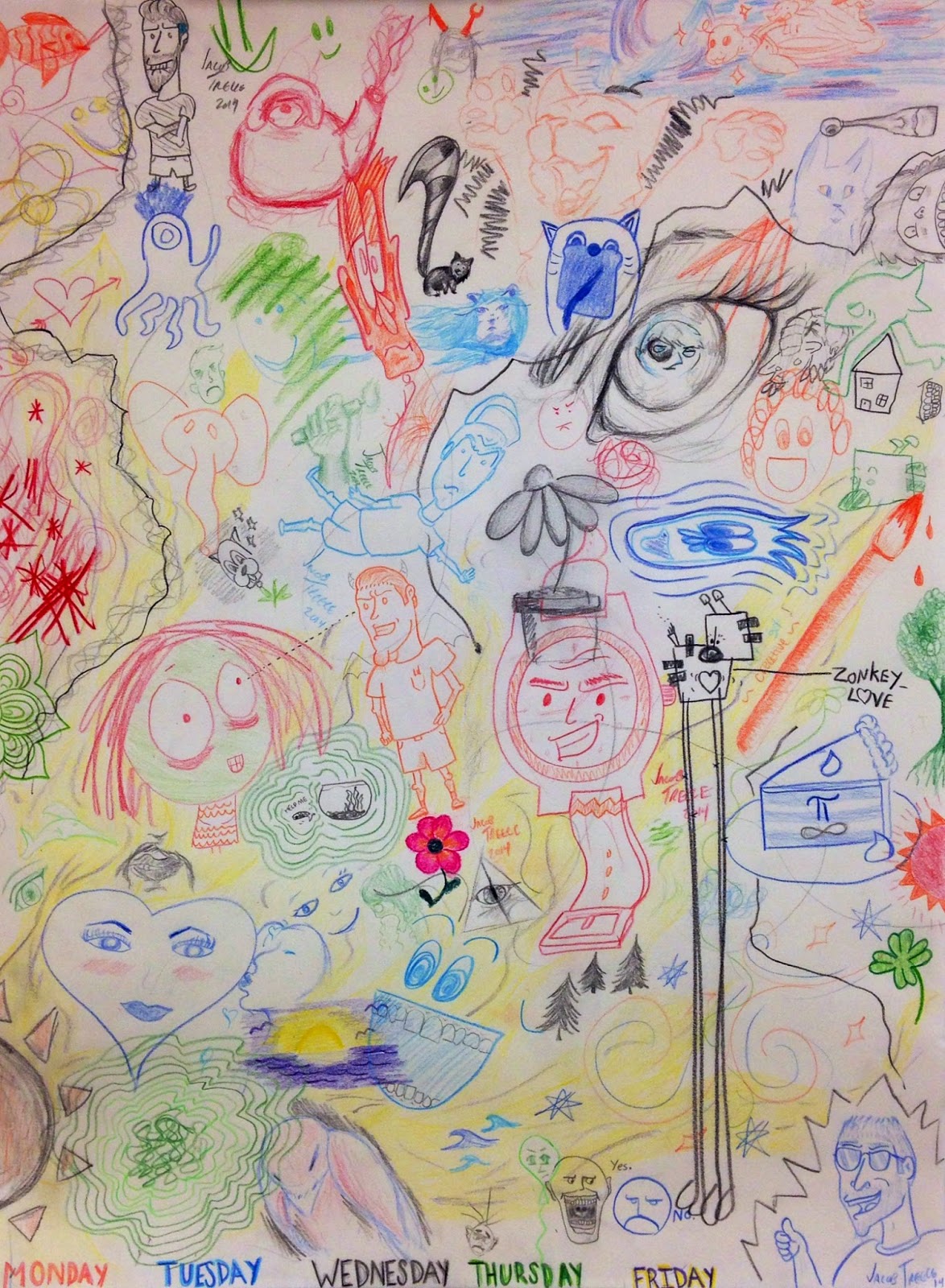
Every day we wake up and come to school or work and ask each other, "how are you doing?" I came up with the idea of showing how other people felt throughout the week by asking them to draw a sketch using the lighter or darker color set out for each specific day. Some drawings/markings were goofy and light hearted, while others seemed deep/nervous/sad.
The day before we started this project, we had done something similar at my church at the end of the service. They set out three canvases with two colors of tempera paint for each, and asked everyone to come up and make a marking with their fingers that represents they are a part of the church community. When all of the markings were done, the canvases were filled up with different elaborate markings and showed how we were all united together. This inspired me to do something similar for my piece, and show on one page how throughout the week we go through similar feelings and experience the same emotions.

Artists collaborate.
Instead of asking for feedback on my project, I had other students help me create a collage showing their emotions throughout each day. After a week, I was able to fill up the whole page and got a bit of an insight into the pattern of emotions teenagers feel everyday. 


Artists communicate through their work.
This piece is intended to show that everyone has their good days and their bad days, and all experience similar emotions throughout our lives.  At one time or another, we all feel like we are alone in our own little world where nobody understands how we feel.  What people need to realize is they are never alone and even if someone has a different lifestyle than you, they can still relate to you in some way and help you through whatever roller coaster of emotions you are having.  I love this piece because depicts what people around me are like and what type of personalities they have. 

Wednesday, March 26, 2014

"Lightning" Bugs - Appropriation Project - Final Snapshot

Artists reflect.
I had a lot of fun doing this piece but didn't really take a step back and look at it as a whole until I had the "lightning bugs" completely done in Photoshop.  It is easy for me to imagine things like this project in my head, but I find it very hard to explain them until I finish the entire thing.  I am so tedious with certain details that I repeatedly find myself going over any mistakes I may have missed, and attempt to fix them no matter what.  Other than some of those slight bumps in the process, making this type of art work was a lot of fun.
Artists take risks.
I never used Photoshop very much other than at the beginning of another art class.  I was not sure if using this medium was such a good idea, but after tweaking a few parts of it, I knew this was going to turn out great and there was no going back.  It was a bit risky using all the still life you can see in the piece because there was an extremely high probability that I could scratch or damage the photocopier while working.


Artists solve problems.
Just like any other artist, I ran into a few dilemmas that slowed me down, but I never let them ruin my entire piece.  One major issue I had when editing was making the colors a bit more vibrant and look like they are glowing along with the lightning bugs. It seems like such a simple fix, but when one looks into it, it is extremely tricky to try and have it all flow together.  I had to add a bit of an ambient glow to the lightning bugs and inside the lantern to make it look more realistic, and a few times ended up putting a glow that was too strong or not the right color. Even though I struggled with that, I learned that handling technology requires patience and a good eye to make sure you don't leave anything out. 

"Lightning" Bugs - Appropriation Project - Snapshot 1

Artists create original art.
When we were coming up with ideas after seeing other examples of appropriation, it was difficult to come up with something clever and different from what we had seen. I had watched a television show the night before that had incorporated lightning bugs into the story line and an idea just popped into my head: why not make literal lightning bugs?  
Artists collaborate.
When developing my idea and helping other people at the table around me, we all had a chance to give ideas on how to improve our pieces and what would work best for other people. I tried doing a bit of watercolor at first but thought it would be nice to do different mediums and ended up choosing mixed media/technology. Another art teacher had attempted to use the photocopier and still life to make a few projects before, which inspired me to attempt the same thing and go all out with many different layers of copies.  I loved what she did to make the artwork, and her technique really helped me come up with great new ideas on a non traditional piece.

                                      
Artists develop art making skills.
I learned that when it comes to Photoshop and editing, patience is key.  More times than one I had to go back and fix something, or wait for the computer to load because the program would work very slowly. I needed a bit of help from classmates and my teacher with figuring out Photoshop at first, but once I got the idea I found it to be really fun and I was proud when everything came together in the end.  I didn't use too many familiar materials, but we had done some Photoshop edits on things from past art classes, and I had to learn new techniques for using the computer and photocopier so I could make more layers.  I learned many new things about Photoshop I never knew before, and now it is one of my favorite programs to use.

Sunday, January 12, 2014

Book Carving - We're All Stories in the End


I had a tough time trying to figure out what I was going to carve because I wanted to try to make my project stand out a bit.  I thought of a few good ideas but my favorite was the Tardis from one of my favorite shows, Doctor Who.  The Tardis was a similar shape to the book and I thought it would be a fun thing to create, so I got to work on designing it.  We were told to be really careful about what we cut out for each layer and don't leave any "islands" that would fall out which made me really nervous.  I had to make sure I wasn't cutting the wrong part out and stopped myself a few times before I cut a new layer out after my border so I wouldn't ruin the whole piece.  It was especially difficult for me to cut the smaller windows on the top because if I slipped, I would cut them into one big window and not be able to fix them.  I cut one or two pages doing that and had to hide some tape on the back of those layers so they would stay together.  The last thing I had to do to finish it was figure out how to get a little light to fit in the book but I came up with the idea of carving farther back into the book and fitting a doll light in there so it would be like the light in the show.  It was very tedious work and I wanted it to look like a mini replica of the real Tardis so I had to pay attention to detail and luckily for me, it worked out and I was able to mix the right blues together.  I took a risk with painting almost all of the book blue, but if I did it any other way, I highly doubt it would look just as nice.  I felt the book was a massive success and I was really excited when I found a quote from the show I could put on the cover that related really well to the theme of the project.  I wouldn't change a thing about my project and it's one of my favorite we've done this year.

Sunday, January 5, 2014

Mixed Media - What Goes Around Comes Around


One of my favorite rides to go on when the fair comes to town is the Ferris Wheel, so I thought a great way to show amusement would be to make one for this project.  I used a variety of different colors and patterns in this to make it stand out, which also brightened up the piece.  First, for the background, I found some strange blue fabric and thought it'd be perfect for the sky.  I knew I needed to make the ground for the Ferris Wheel to stand on, so I used different shades of green tissue paper and glued the pieces onto the paper a certain way so they would stick up like grass would.  When it came to the spokes and the support legs, I found scrap papers with neat designs on them and decided to use them to help catch your eye.  Finally, when it was time to put the actual wheel and passenger cars on, I thought it would be a cool idea to find pictures of different cars from a variety of Ferris Wheels and put them all together to make one big wheel.  In my opinion it turned out pretty well, and to tie it all together and bring some more color into the piece, I added some outlines to each part using acrylic paint, and wrote the quote "what goes around comes around" around the ride.  The lessons we had in class showed me that it's okay to have different patterns that wouldn't usually go together in one piece, as long as they go with the theme.  I struggled a bit more with this project because I'm not used to using all different mediums like this and I felt conflicted on what exactly to make.  I even had to cover up a piece of cloth I was going to use because I started taking the picture in a different direction.  Once I decided what to do and finally covered the cloth up, I was able to move forward and finish the piece.